The map changes what you notice
Compare two views of the same coastlines and see how projection, scale and data choices change a map’s message.
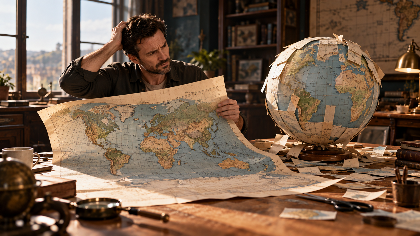
One world in two views
Look at Greenland in the two maps accompanying this article. In the rectangular Mercator view it occupies an enormous amount of the page. In the Mollweide view, its relationship to Africa looks very different. Africa has not expanded. Greenland has not shrunk. The coastline data are the same.
What has changed is the method used to turn a curved surface into a flat picture.
That sounds like a technical matter until you think about how much geography you learned from a rectangle on a classroom wall. A map gives you facts, but it also gives you an impression: which places seem substantial, which seem peripheral, which appear near each other. You can carry that impression around long after you have forgotten the legend.
The useful response is to become more curious about the map. Before asking whether it is accurate, ask what it is trying to preserve.
Something has to give
A globe can represent the Earth’s surface without the particular compromises involved in flattening it. A world map cannot preserve every area, shape, distance and direction at once. Its projection is the mathematical arrangement of those compromises.
The Mercator projection preserves local angles. It also draws a course of constant compass bearing as a straight line, a property that made it useful for navigation. Those are substantial achievements. They come with an equally substantial cost: areas become increasingly exaggerated towards the poles.
A familiar rectangle can therefore give a poor answer to the question “How much land is there?” You cannot judge the relative areas of widely separated countries simply by comparing their apparent sizes on it. Nor does a straight course on Mercator automatically show the shortest route across the globe.
An equal-area projection makes a different bargain. The Mollweide view preserves relative surface areas, while changing shapes. Notice how the outlines look less familiar near the sides. You have gained a more useful picture for comparing extent, but you have not acquired a universally correct map.
John P. Snyder’s US Geological Survey manual describes a whole range of projections and their purposes. The variety is the point. Mapping a small region, planning a voyage and comparing the world’s land areas are different jobs.
Keep the comparison fair
The accompanying pair uses the same land polygons, colours and central meridian. Both stop at 85 degrees north and south, so a change in the visible extent is not responsible for the difference. The poles themselves cannot appear at a finite distance on Mercator.
There are no population figures hiding in the shading. Land is simply land. The coastlines come from Natural Earth, a public-domain dataset generalised for small-scale maps. That means minor coastal detail has been simplified. This is a picture for seeing continental relationships, not finding a landing place for a boat.
Compare Greenland with Africa within each view. Then try northern Canada and South America. The exercise works without declaring one continent important and another unimportant. You are watching a drawing method change the amount of attention a place receives.
Even the centre matters. Put the Pacific in the middle of a world map and the ocean becomes a continuous presence rather than two pieces at opposite edges. No voyage has become shorter. You have changed where the page interrupts your view.
Scale is a separate decision
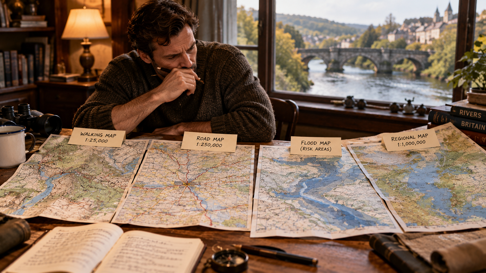
Projection is only one choice. Scale determines how much ground a given length on a map represents. On a local map labelled 1:25,000, one centimetre represents 250 metres on the ground. At 1:250,000, that centimetre represents 2.5 kilometres.
The first can make room for detail that would become an unreadable tangle on the second. The second can show a region without requiring you to unfold a sheet across the kitchen.
Imagine planning a day beside a river. A road map might make the bridges obvious. A walking map could bring out paths, gradients and access information. A flood map would ask you to look at the same banks differently again. A blank-looking patch on one does not establish that nothing is there. It may only mean that the things there fall outside the map’s purpose.
This is why a beautifully detailed image is not necessarily the right guide. The detail has to answer your question, and the map has to be current enough for that use.
Data can redraw the story too
A population cartogram makes another kind of change. It can resize territories according to the number of people they contain rather than their land area. The distortion is deliberate and driven by data. It is not simply an alternative projection of the same geographical surface.
A large, sparsely populated territory might become small; a densely populated one might swell. Such a picture can help you think about where people live, provided the dataset, date and method are clear. It would be a terrible map for estimating a journey.
Colour introduces further choices. Imagine two maps of hospital admissions: one colours each district by its total admissions, the other by admissions per resident. A populous district could look prominent on the first without having an unusually high rate on the second. Both may use correct numbers while answering different questions.
You need the legend to know which question you are being shown. Units, categories, missing values and the boundaries between colour bands all deserve a look before you accept the visual impression.
Read the small print before the big conclusion
When a map catches your attention, spend a moment with its title, source and date. Ask what its colours measure. Check whether the sizes represent land or something else. Look for places omitted at the edges, and consider what detail the scale leaves out.
These habits need not spoil the pleasure. Maps are wonderful partly because they let us look at a familiar world in unfamiliar ways. A map of shipping routes, watersheds or languages can suggest connections that a road atlas never set out to show.
Keep the two world views in mind the next time a map seems to make an argument all by itself. The landscape has a say, but so does the person drawing it. Understanding those choices gives you more to see.